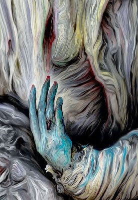
JUDITH EISLER

Smoker (Cruel Story of Youth) , 2003
Oil on Canvas 147 x 178 cm
Hayward Gallery, London
14 October 2007

Four of her works were exhibited as part of the excellent “The Painting of Modern Life” show at the Hayward Gallery. This was my first opportunity to see her work first hand. She works from film stills taken from the paused video or DVD of a film using this as the starting point for her paintings.

I am particularly interested in this type of appropriation (it is something I use myself) and welcomed the chance to compare her work with the paintings of Johannes Kahrs, who also works with film stills, which were conveniently hung in the same room. In the event I don’t think the location worked in her favour as the very strong Kahrs paintings dominated the space.

Unlike Kahrs she crops the original image down to a section or fragment to pick out a detail and generate a new emotion through her painting.

The painting I have chosen is taken from the Japanese film from 1960, Cruel Story of Youth and although I don’t have the precise film still she has worked from, it gives an idea of her working process.

In fact, the painting is so far removed from the original that unless you know the film and the narrative that it brings, you are able to project your own meaning onto the image. I found this painting the most melancholic of her work on show, an aura associated soley with the image as I wasn’t familiar with the filmic reference. The feeling I had was of isolation and solitude, which had everything to do with the title, the tight crop and the differential focus between the protagonist and the background. I did think of teenage withdrawal from society, but mistakenly thought it was a clip from a James Dean film.

The appearance of her paintings owes a lot to Gerhard Richter but I doubt if they are done in the same way. Her style is much more deliberate and although it appears abstract when viewed close up, it lacks the serendipity that I associate with Richter at his best. The paint is thin and the canvas weave shows, but the surface is too uniform for my taste. I suspect the unusual colour combinations and the strong contrast are connected with the process of photographing the television screen with a digital camera. The scale and aspect of the paintings bears no relation to either the projected cinematic image or a television screen. Nor does her painted surface (in this instance) allude to the flickering of a screen image in the way that Kahrs paintings do.

In conclusion it is not a style of painting that I will try and emulate, as I prefer to try and reference the projected film by keeping my paint very luminous, but the tightness of the crop and the differential focus is interesting and perhaps worth exploring further.


©blackdog 2009

Adriana Varejão

O Sedutor, 2004
Oil on Canvas 230 x 530 cm
Victoria Miro Gallery, London
10 October 2004

The show contained four of these immense, almost life size, paintings of tiled saunas and a number of smaller studies on paper that were framed behind glass. Each had a different monochrome theme and I have chosen the one painted in a variety of blues from tinged white to almost black. The blues themselves range from aqua with a lot of green, right through to almost lavender.

O Seductor

Although she has used a fairly heavy canvas, the weave on the surface isn’t prominent indicating that the surface must be heavily primed to get it flat. The process of painting is fundamental to the reading of meaning behind the work and I would say she has started with a dark red ground, perhaps burnt umber and then painted each tile individually. In light areas colours are not just tonally lighter, but slightly warmer. The paint is uniformly applied, but you can see brush marks when looking closely. There is definitely a glaze with the paint and some of the tiles look like two coats with the paler one underneath. This is left to show at the “tile” edges and helps the 3d illusion as do the edges of shadows’ which are subtlety blended over a small area. The other curious point is that all four of the large canvases had rounded corners; this isn’t easy to do and contradicts the rectangular tiles but I cannot guess the significance.

Whilst the use of the grids that constitute these works could hint at modernist aesthetics, her earlier work depicted fragments of tiled wall with rubble made of flesh bulging and bursting through the painted surface. This use of the tile as a recurrent motif refers to the azulejo, a square terracotta tile used continuously throughout Portugal’s history since the middle ages. Influenced over the years by Moors, Spanish, Oriental and Dutch artisans it was used for decoration in such far distant corners of Portugal’s empire as Brazil. So Varejão is invoking the colonial history of Brazil though the use of tiles albeit in a more subtle way in these Sauna paintings.

zujelaria em carne viva 1999.jpg

In these large scale trompe l’oeil paintings, the tiles have become simple, unadorned, abstract and minimalist, but the space the paintings describe is one of empty luxury, hard and cold. Whilst I find this non-space deeply melancholic on account of the implied solitude, that reading may be at variance with her conceptual impulse. In other words what I am reading as an impersonal modern skin of a contemporary “temple” for the body, she may be referencing the opulence of Portugal’s past fuelled by resources flowing from Brazil. Who is “The Seducer” of the title?

©blackdog 2021

Michael Simpson

Michael Simpson

Bench Number 59, 2000-05
Oil on canvas 244 x 534cm
The Tithe Barn, Bradford on Avon
September 2005

This is one of four related paintings exhibited in 2005 in Bradford on Avon. Psalm (Bench #54) and Prayer (Bench #55) at the Old Gas Works and Hymn (Bench #58) and Song (Bench #59) at the Tithe Barn. They are four paintings that form part of Simpson’s ongoing body of work that started in December 1989 and are known as bench paintings, each un-named but sequentially numbered. They are an ongoing homage to the Neapolitan philosopher Giordano Bruno, mutilated and burnt alive at the Campo di Fiore in Rome for heresy in 1600.

Bruno had written of an infinite universe which had left no room for that greater infinite conception which is called God. He could not conceive that God and nature could be separate and distinct entities as taught by Genesis, as taught by the Church and as even taught by Aristotle. Living in Venice in 1592 he was imprisoned and then sent to Rome where he was questioned and tortured in a papal prison and finally judged a heretic. A sensitive, imaginative poet, fired with the enthusiasm of a vision of a larger universe he was martyred not for politics, but for his scientific thinking being ahead of his time.

The use of the bench as a motif can be seen as a metaphor for Bruno’s time spent waiting in prison for his fate to be decided but also a place where justice and injustice are administered. Apart from the very first bench painting none of the works have any figures in them and over time they have become more austere. This series of four perhaps relate directly to the Church and by inference atrocities committed in the name of God. The elements in the painting are few; apart from the bench itself, the division of the space into shallow foreground and wall the other two elements are the ventilation grids below the bench and a church notice board in the upper right hand corner. Psalm (Bench #54) and Hymn (Bench #58) have specific collections of uplifting spiritual works listed on the notice board. Prayer (Bench #55) and Song (Bench #59) are blank. In a more chilling interpretation of the grids, I could see them as drains but perhaps my imagination is too active. They certainly help establish depth on the flat surface.

The most striking aspect of all of the works is their scale which is twice life size. This prevents the image being read as a window onto another world despite the illusion of depth that has been created. For me this anchors the paintings in reality and makes them an object of contemplation. In fact looking hard has its rewards too; gradually you note the making of the painting is evident. The subtle ribbing of the surface, the subsequent layers of ground colour stopping short of the perimeter edge (impossible to see in the reproduction) and the delicate glazes evoking the fall of light on the bench.

They are paintings that give expression to the idea of the dark, insolent and terrible power of belief, giving form and colour to the nonrepresentable. A very minimalist melancholic vision that was well suited to the exhibition venue.


©blackdog 2021

Elizabeth Peyton

Elizabeth Peyton

September (Ben), 2001
Oil on Panel 30.8 x 23.2 cm
The Royal Academy, London
September 2002


I first came across her work at the "Galleries Show" at the Royal Academy in September 2002 and was very taken with this portrait of a lost soul.

Peyton made her name with paintings of male celebrities, on the one hand rock stars whose flames had burned too bright, and on the other those from royalty and the annals of history. The smallness of the work and the delicacy of the brushwork, despite the apparent speed of its execution, gives the painting an appropriate intimacy that suggests a close friend or lover. Yet the likeness is tinged with sadness and the idealised features of the subject hark back to her idealistic representations of doomed dandies. In this respect all of her portraits carry this melancholic lineage that although contradicted by the lightness of her painterly touch, says as much about her as it does about the subjects.

Peyton Ben.jpg


It is from her own photograph and is one of several studies. Whilst it lacks the blurry "photographic" close-up crop of many of her icon portraits, it still has a photographic signature. It is almost as though it was taken with no thought to composition, a naive "Ben with sunset" snapshot - the off centre figure losing his knee in the process. This "snapshot" impression is further reinforced by the apparent speed of the painting, capturing the fleeting posture as he raises his hand to his shoulder. In an interview with the Hayward Gallery in 2007, she states her preference for working with ‘images that are incidental and anecdotal, rather than formal – they have more information to pick and choose from when it comes to making a composition’[1].

It is the unusual framing of the figure within the portrait that drew me to this image - seated well off centre he is crowded into the bottom right hand corner of the painting. The focus is almost on the lurid sunset on the horizon and our wavering attention is matched by his disinterested air as he gazes off to the right into the unseen distance.

As with all her works it is brightly coloured using a full palette of unmixed colours, the most striking of which is the streak of cadmium red across the horizon. There are two blues, yellows, browns, pinks and greens each isolated and pure. Some small elements are almost Matisse like in their separation. The larger areas have been wiped back to give a range of tones. The flesh almost white, with colour at edges. The lips are very red. The hair is painted with thick confident brown strokes. Thin washes and allowed to run in trousers. I have seen quite a few of her works now and this is typical with thin glazed colours applied individually, giving a very intense saturated surface, the almost smooth ground allowing maximum reflected light.

The panels for her paintings are about 2cm deep and are covered with very thick layers of acrylic primer. This has been applied with a scraper of some kind (I used to use a credit card) and the thick paint runs over the edges and the ridges in the surface become an integral element of the artwork. Paint is mainly transparent and the vertical ridges can clearly be seen in the reproduction above.

Names her favourite painters ranging from Velazquez and John Singer Sargeant to Andy Wharhol and David Hockmey. I see Karen Kilimnik and Florine Stettheimer (art deco influenced modernist d1944).


[1]Elizabeth Peyton in conversation with the Hayward Gallery ‘The Painting of Modern Life’ Hayward Publications 2007 p133


©blackdog 2020

Edouard Vuillard

Nape of Misai’s Neck, 1897
Oil on board mounted on cradled panel, 13 x 33 inches
Royal Academy, London
31st March 2004

This extensive show covered not only his paintings, but also featured his drawings and photographs. Although there were many paintings of gloomy interiors that betrayed his interest in the theatre of Ibsen and perhaps the influence of Edvard Munch, I preferred his intimate portrayals of his mother sewing, and her clients trying on their new dresses. These and the portraits of close friends record the melancholia inherent in the everyday and have a claustrophobic intensity that he shares with Pierre Bonnard. So rather than a bleak interior, the painting I have chosen is of Misia Nantanson, the wife of one of his clients, and for a time the object of his desire.

vuillard.jpg

Misia Godebska, a Polish pianist and pupil of the composer Gabriel Fauré was attractive, intelligent and capricious and after her marriage to Thadée Nantanson, she gathered around her a group of bohemian admirers. There is little doubt that Vuillard fell under her spell; he helped her to decorate her apartment, went with her to exhibitions and in the 1890’s painted her more than any other person outside his family. The setting is the Nantanson’s country house in the summer and the pose suggests that the painter is watching his hostess engrossed in reading perhaps. Despite the small size and the simplicity of the restrained palette the loose matte brushwork in creams and yellows contrasting with the violet notes in the background, keeps the surface vibrant and suggest the torpor of a hot summer afternoon with little to do.

However, rather than ennui, you get a real sense of the voyeuristic presence of the artist, as his subject, with her face hidden behind a lock of hair, looks away leaving her neck exposed to his gaze. The sense of unfulfilled romance is palpable and it seems Vuillard was destined to “long after women” from a distance as he never married and lived with his mother until her death in 1920.

The extraordinary long rectangular shape of the painting reinforces the claustrophobic intimacy as the viewer looms above the vulnerable neck. The tight crop, although not the shape of the image reflects Vuillard’s use of photography as an aide memoir, he owned a Kodak and took thousands of photographs including several of Misia Nantanson that afforded him the luxury of extending his indulgence. However, the flatness of the image and the vulnerable neck as subject recalls Japanese prints, in particular Utamaro’s images of courtesans.

24_Girl_Powdering_Her_Neck_Kitagawa_Utamaro.jpg

As Vuillard states in one of his journals: “The expressive techniques of painting are capable of conveying an analogy, but not an impossible photograph of, a moment. How different are the snapshot and the image.”[1]

No doubt he felt his painting was a better vehicle for conveying his true feelings than the photographs of her that often featured her husband, albeit out of focus.

[1] Easton, Elizabeth Wynne, The Intentional Snapshot Vuillard Catalogue National Museum of Art Washington 2003 p431

©blackdog 2020

Eberhard Havekost

American Lip Gloss BO6, 2009
Oil on Canvas, 95 x 150 cm
White Cube Hoxton, London
3rd April 2007

This painting was in his exhibition of new work in the White Cube and selected for ‘The Painting of Modern Life’ exhibition at the Hayward later the same year. I don’t care for his technique, but the interesting choice and range of subjects meant the exhibition was better than I expected.

44 Havekost.jpg

All his work is based on photographs he has taken himself, video stills or found images and as the gallery handout explains; ‘using a computer, Havekost might crop, stretch, skew or tweak the colours of the picture, or leave it almost untouched before making an inkjet print that he uses as the direct source material for the final painting.’

A figure in white is slumped in the passenger seat with the seat belt on. The car interior is definitely American with their dreadful taste in seats and trim in almost matching garish colours. The head is obscured as the seat is tilted back. A pair of sunglasses are tucked into the door handle. The situation is ambiguous, the person could have been ravished, involved in an accident or murdered. The title doesn’t help and could be euphemism for the smear of red blood running from the face down the front of the passengers white jacket. I since read in a review for the Hayward Exhibition that the image is based on a widely circulated newspaper photo showing a German visitor to Miami murdered in her hijacked car.[1]

Probably the strongest melancholic notes comes from the subject matter, a holiday in the sun tragically cut short, but I also identify with the way he has rendered the interior of the car. He uses the blur of the brush work to unify his images, treating all images equally, but it really works for this subject. I can believe the nasty velour of the seats and the fake leather panels on the door. For me there is a depressing sadness of this pathetic attempt to make a poor substitute look cheerful and appealing, and that more than anything is American lip gloss. The cheap fake alternative to the ‘real thing’! Interesting to think that it is this interior detail that will fix the image in time and provide a commentary on a period in history. I don’t think the tampering with the perspective of the interior in the car adds to the melancholic aura of the image other than serving as a method for providing distance between the painting and the original image.

[1] Dorment, Richard Review of ‘The Painting of Modern Life’ Daily Telegraph 2007


©blackdog 2020

Matthias Weischer

Ecke, 2005
Oil on Canvas, 40 x 30 cm
51st Biennale, Venice
1st November 2005

Despite his work being in the Saatchi collection and at Frieze 2004, I had never seen it in either print or at an exhibition before. This is a man who is obsessed with interior space. Almost every painting shown was an interior, all sparsely furnished and unoccupied. In fact I cannot even remember a door or window and the overall effect was of very claustrophobic spaces. I felt they were almost a mental space rather than an actual space - probably because there were limited details to associate with.

weischercorner2005st.jpg

My favourite was this simple painting of just a corner. It is typical of the work shown, exploring space through the construction and deconstruction of an imagined interior by building up layers of paint at the same time as creating overlapping perspectives. The paint is so thick that it overhangs the edge of the canvas (see below) making the image almost a sculpture. Then having created the space and depth within the picture, with the thickly painted surface he reminds us of the flatness of the painting by covering areas with fine speckles or drips of paint.

In all of his interior views there is an all-prevailing absence of a utopia, they are sites that seem to have no relation with the real space of Society. However, nor are they sites of voyeurism like the sets of television reality programmes such as Big Brother. These are fundamentally unreal spaces, offering nothing to distract the occupants from their own existence or let them forget their own life. We are given no clues as to the function of the rooms and without windows and doors it is as if the outside world doesn’t exist.

95 weischercorner2005side.jpg

The other interesting aspect of these spaces is the difficulty one has assigning a date or a period to them. Devoid of meaningful visual clues, even when a sparse piece of furniture or decoration is included, we are thrown back on regarding the walls as intersecting colour planes. For me this reinforces the notion that these rooms are psychological rather than physical spaces. Without a connection with time or reality they become somewhere to mentally retreat to, and be alone for reflection and contemplation.

©blackdog 2020

George Shaw

Scene from the Passion #53, 2002
Humbrol enamel on board, 77 x 101 cm
Tate Britain, London
March 2003


Seeing George Shaw’s work for the first time was one of the highlights of the ‘Days Like These’ triennial showcase of the work of contemporary British artists. The paintings struck me as being perfectly modern images, combining the horror of the non-places of my own childhood with a superficial beauty that photography cannot capture. The painting I have chosen shows a row of three derelict garages presumably in Tile Hill, Coventry the scene of his childhood. Like all his paintings it is taken from his own snapshot photographs that have been edited to remove references to specific time and date. I find this detail an interesting choice given the painstaking photo-realism of the work implies verity. In fact we have a tampering with reality and consequently the emotional impact of the image.

80 Scene from Passion.jpg

The painting is composed centrally across the horizontal board and is conventionally divided into thirds. The colour scheme is very gloomy. He uses just seven colours of paint for all his work - this example is predominantly grey and green Humbrol enamel. This unusual selection of paint doesn't reflect a childhood obsession with painting Airfix models - just a happy accident![1]

Whilst I used to make the models I could never be bothered painting them, primarily because of the difficulty of working with this paint! So how he achieves such flawless photo-realism without any evidence of brushwork is incredible. The beauty of the painted surface is at total variance with the subject matter and I think it is this disconnect that adds to the melancholic strength of the images. The shadowy gloom of some of his work evokes the dark glazes of Rembrandt which is all the more remarkable given the materials he uses.


[1] Stout, Katherine Days Like These Tate Publishing 2003 p138

©blackdog 2009


Vilhelm Hammershøi

Vilhelm Hammershøi

Resting, 1905
Oil on Canvas 49 x 46 cm
Royal Academy, London
3rd July 2008


A woman is seated on an open backed chair, with her hair gathered up in a bun. Her right arm is hooked over the back of the chair. Her gaze is at the wall on the left hand side of the painting. She is wearing a black skirt and a dark grey blouse with puffed sleeves and a scooped neck. A piece of porcelain is on a table/dresser on the right and side. Light is coming from the left hand side of the painting and catches the back of her neck and the porcelain bowl. A shadow is cast on the floor and wall on the left hand side.

Canvas is quite fine and has a thin umber colour over the primer. The painting has been built up with a series of thin washes, particularly noticeable in the blouse. Uses a round brush very confidently to apply thicker paint to depict the folds in the blouse; reminds me of Manet. Particularly liked how he uses the paint to delineate the arm, but the body of the blouse is just the ground colour.

Hammershøi Resting.jpg

Uses thicker paint on the neck which is applied with short brushstrokes of a short flat bristle. The back of the chair has a similar treatment with the brush work following the form, although he does leave some small areas without paint. Brushwork for the wall is almost cross hatching except where it meets the figure, then it follows the form. The light to dark transition of the shadow on the wall looks to be in slightly thicker paint – although this appearance might be as a result of wet in wet blending.

The painting is behind glass, so it is hard to tell how rich the oil in the paint is, but looking at unglazed examples from the same year, I would say the paint is lean and has been varnished afterward.

The composition is a series of right angles, which clearly owes something to Whistler’s Arrangement in Grey and Black: The Artist's Mother from 1871. Like Whistler, he conveys a sense of harmony with his composition, but I think Hammershøi’s painting is much more melancholic. It is the anomalies within the painting that I perceive as melancholic.

The fact that the sitter is deep in self-examination displaying total indifference to the spectator is the main incongruence in what is a classic portrait composition, but there are other more subtle nuances. The crop of the flower-shaped bowl laid on the sideboard, the loose brush work in such a tight ordered composition, and the arm hooked over the back of the chair.

In this as with all his other paintings shown, nothing is seen to be happening, and as Felix Krämer notes in the exhibition catalogue ‘the figures introduce no element of vitality into the rooms’[1] resulting in a pervasive mood of ennui and time suspended.


[1] Felix Krämer Vilhehm Hammershøi: The Poetry of Silence Hammershøi Catalogue, Royal Academy of Arts 2008, page 25


©blackdog 2020

Michael Borrëmans

Michael Borrëmans

One 2003
Oil on Canvas 70 x 60 cm
Parasol Unit, London
4th June 2005


The last time I visited this space it was housing the Carnegie Art Award in 2004. Since then it has been transformed from a crumbling warehouse into a really beautiful exhibition space. I was one of the first visitors after the opening and the polished concrete floor is amazing. I would love one in my own studio! This was the first work I had seen by Michael Borrëmans, and it was totally suited to these airy pristine galleries. The work was sparsely hung and I had plenty of opportunity to contemplate the paintings.

It was very hard to grasp the meaning of his paintings, but the pervading mood throughout the work for me was one of melancholia. With so many melancholic works in the exhibition, I find it hard to choose a specific painting. I have picked a very interesting profile of a self absorbed woman whose melancholic mood has something in common with Dürer’s Melencholia I. She is in a doll-like state between dreaming and vigil.

09 Borrems.jpg

The ground is various random sketchy marks made with different brushes and blue grey paint. This has then been knocked back with a thin pale glaze. The figure is painted over the top, realistically for the face and hands, but very sketchy for the shirt - in fact little more than outline with a few pearly white highlights. His painting shows painterly flourishes of Baroque pictorial economy similar to Velásquez. Light comes from behind the figure and is painted very delicately - no deep shadows.

The fascinating bit is the oily rich brown glaze over the lower part of the figure, yet around the arms and hands. It looks like she is seated at a table that goes right through her, turning what could be read as a straightforward portrait into something much more enigmatic. This surreal notion of the figure evolving from the table links his work with the paintings of Magritte and other examples of his work demonstrate temporal disconnect more clearly.

As to the meaning of the painting, I find it pretty impenetrable - the title doesn't offer a clue (this was same for all the paintings). Is she working on the table surface or contemplating her hands? She is gazing down at her hands very intently so perhaps she is preparing to type, yet there is no typewriter? Hand gestures are also a repeated motif in other works in the exhibition, and it each case the action looks frozen.

The hair cut looks like a style from the 1940's and the face seems to have the austerity I associate with the period. It is probably painted from an old photograph or made to look that way. This reference to a time past enhances melancholic feel of the image and instills a certain feeling of nostalgia. In an interview for with Luk Lambrecht for Flash Art he acknowledges working with existing images, ‘Sometimes these images are indeed photographs from a distant past. I attempt to create an atmosphere outside time, a space where time has been cancelled.’[1] In fact, I do get a sense of time being frozen – she is almost a still life, concentrating on what she is about to start, but never actually starting.


[1]Luk Lambrecht MICHAËL BORREMANS - I AM AN AVANT-GARDE ARTIST! Flash Art Online (Translated from Flemish by Dirk Verbiest)


©blackdog 2020

Euan Uglow

Lemon, 1973
Oil on Canvas, 19 x 33cm
Private Collection, Not Seen

In July 2003 I went to see the first public exhibition of the work of Euan Uglow since his death from cancer in 2000. Disappointingly this painting of half a lemon was not included in the show. It is quite unsual in that most of his work whether of nude models or still life involved a dynamic pose. The artist notoriously placed his models in geometrical and sometimes stiffly contorted poses and since he sometimes took up to five years to finish a painting and only ever painted from life, his models had to keep such poses for considerable lengths of time.

1973-Lemon-19x33.jpg

There is a sense of harmony within the image, not just about the placement of the lemon on the grey shelf, but also the weight of the graduated yellow in relation to the size of the background. The lemon is strongly lit from the right and his planes of colour give a suprising degree of three dimensionality to the flat surface.

I have seen a lot of Uglow’s paintings and drawings and this looks typical of his method working. Taught by William Coldstream at the Slade School of Art in London, he used little registration points and tiny painted crosses to help the drawing process. It is worth noting that his obsession with accuracy ran to marking these reference points on the skin of his life models and that they had to keep these marks between sessions. These marks always remain in the finished painting, revealing the history of its making by a prolonged process of looking hard.

He sometimes took up to five years to finish a painting and only ever painted from life and the marks become a record of the temporal aspect of painting. This recording the passage of time is taken a step further in a little painting I saw in his exhibition at the Holburne Museum of Art, Bath called Diary of a Pear, 1972. He placed the tip of a pear at the exact centre of a perfect square, but he painted so slowly that the pear rotted, and the tip drooped. So each day he began a new square with a new centre point and a series of marks showing where the tip had once been. He has said in interview that he “isn’t interested in producing pictures; but in personal research”

Perhaps because of this perfectionism his paintings seem to lack emotion and whilst I find them technically interesting I don’t feel that they have a melancholic aura, even when the subject is a lonely half a lemon.

©blackdog 2020

Leon Golub

Interrogation II, 1981
Acrylic on Linen 305 x 426 cm
Irish Museum of Modern Art ,19 September 2000

This was an immense exhibition of over 80 piaintings by this American artist and the first time I had seen his work first hand or in reproductions.

Totally unprepared, the shock of seeing so many of these larger than life scale paintings of oppression and cruelty was palpable. Golub's massive unframed canvasses depict scenes of mercenary killings, torture, and death squads. The show made me feel uncomfortable long after I had left and I could have chosen many individual works to write about, but this one stuck in my mind.

39 interrogation II.jpg

Like the other 38 large scale works it is on unframed but primed canvas that like sailcloth has had large eyelets attached to allow the work to be stretched. He works from an image bank of collected newspaper and magazine clippings and photographs of various body types, violent acts, and weapons. Then using these photographs as models, he draws directly onto the large canvas and then applies layer upon layer of paint, scraping back and reworking the surface in the process. The result is an expressionist surface where the figures, although unified by the process, lack any modelling making them as flat as the space they occupy.

The interrogators of the title are not specifically located, but through the device of flattening the image plane with the red oxide ground and cropping the legs, a continuity of space is suggested between them and you, the viewer. This breakdown of the gap, the enlargement of the protagonists and the direct eye contact they make suggests not only their power, but also makes you feel involved and complicit.

This ability to take the viewer into areas restricted from the public gaze took a dramatic shift with the images of torture that came out of Abu Ghraib in 2004, making Golub’s images of Mercenaries posing for the viewer/camera seem prescient. However, this need to expose the suppression of similar kinds of torture by the state is not new in art and Goya’s Disasters of War series of etchings from 1808-20 are clearly an influence on Golub’s work as might be Max Beckmann’s 1919 painting The Night.

Unlike those works and despite a process that implies loss (the painting and scraping back of the image, eroding and reconstructing the image) I don’t find the image melancholic. Is this something to do with the denial of the victim’s identity? Perhaps the victim as a sacrifice allows him to become a scapegoat and we fail to identify with his suffering.

These are not images to be seen in a book, as the predominant aura comes from the power of the mercenaries and their invasion of the viewer’s space and the work requires the audience's participation to make it complete. Consequently, whilst we may deplore the torture, part of us is relieved that it’s not us under the hood, and the knowing looks of the men drive home our complicity in the almost pornographic action. Maybe that’s the inherent sadness of the image, not man’s inhumanity to man, but the fact that like hard core pornography it is supposedly done for our benefit?

©blackdog 2020

Norbert Schwontkowski

Das grüne Leuchten, 2005
Oil on Canvas 55 x 70cm
Not Seen

Unfortunately I have only seen this painting in photographic reproduction, which isn’t ideal for such a subtly painted work. However, I have seen a number of similar pieces from the same time at art fairs, which gives me an understanding of his process and how the finished paintings look.

Schwontkowski green ray.jpeg

He adds metallic oxides to his ground which lead to unforeseeable changes of colour in his paintings as the chemical compositions change through oxidation. He will start a canvas, leave it to mature for a couple of weeks and then return to it and modify the altered state.

Like most of his work, the image comes from his imagination rather than an appropriated source. It shows a tiny incident all too familiar from my childhood holidays - our car was always breaking down too! Innocent in itself but the gaseous lime green glow hovering on the horizon fills the image with a sense of dread. The family watch from a safe distance whilst the father, head under the bonnet tinkers with the engine. It is almost as if the family are hovering on the horizon between mundane reality and the surreal happenings beyond.

The painting has a gentle naive quality, but as with all his work the title and image are inextricably linked, and translating this title as The Green Light we see he has a sense of irony too; green for stop rather than go! I associate the green light in this painting with the dreary tones of winter skies that warn of an immanent snowfall, but it could also be read as a green ray. These are rare optical phenomena that occur shortly after sunset or before sunrise, when a green spot is visible for a short period of time above the sun, or a green ray shoots up from the sunset point. It is usually observed from a low altitude where there is an unobstructed view of the horizon, such as on the ocean.

Although it is the image itself that fills me with a sense of loss, the process is a key component of the melancholic feel of his paintings. It is like a slow version of the development process associated with wet photography and results in the luminous glow of pastel colour that haunts his work.


©blackdog 2019

August Strindberg

Purple Loosestrife, 1892
Oil on Canvas
Tate Modern, London 2005

I was surprised how much I enjoyed this exhibition, I found it both charming and melancholic and was interested to read that he was a Gemini and prone to mood swings. Strindberg was clearly influenced by Northern Romantic [1] landscapes, but had his own expressionist way of painting that relied more on the palette knife than the brush. There were many of Strindberg's dark brooding seascapes that shared a single man-made object at the mercy of the elements: a buoy in the midst of a stormy sea, or a startlingly white navigational mark against a tempestuous sky. Several paintings of lighthouses conveyed a similar mood reflecting his inner turmoil, but most interesting were his astonishing delicately painted pictures of wild flowers set against a very loosely knifed / brushed landscape. If these earlier solitary flowers are also to be read as symbolic self-portraits he chose very unappealing plants, thistles, toadstools, and "weeds".

Purple Loosestrife August Strindberg

Purple Loosestrife is typical of the genre, with the painting divided by a pronounced horizon and the plant a small element isolated in the landscape. The mark making is vigorous but the mood is serene and melancholic, he uses a buttery yellow thickly applied with a palette knife for the foreground gradually merging with a blue/white shoreline and then above the horizon line similar blues and whites for the sky but painted in a different style. He was clearly an acute observer of nature and the plant named in the title is painted with accurate botanical detail, causing it to stand out sharply against the loosely painted landscape.

These small flowers in the vast landscape reminded me of the paintings of Caspar David Friedrich that also use the shoreline as a metaphor for the daunting vastness of the world. Whilst it isn’t as dark as Friedrich’s Der Mönch am Meer, for example, it shares some of that painting’s depiction of the sublime; a boundless, silent, solitude. These qualities were typical of all these paintings of solitary flowers that were painted on the shore south of Stockholm and even more pronounced in some e.g. in Lonely Poisoned Mushroom (also 1892) there is no clear division between the land, sea and sky. I found myself reacting to the emptiness in these calm paintings much more than the violent seascapes, as at least in those there was the storm to provide a narrative!

[1]Strindberg wanted Bocklin's painting “The Island of the Dead”, to serve as the final image of his 1907 play The Ghost Sonata

©blackdog 2019

Michael Raedecker

Tipping Point, 2007
Acrylic and Thread on Canvas, 198 x 336 cm (3 Parts)
Hauser and Wirth, London 2007

I always find the wood panelled rooms of this old bank building a strange space to exhibit large contemporary paintings. This show of a mixture of Michael Raedecker’s work was no exception. The subject matter covered the familiar modernist houses, flowers and ruins. The stand out piece for me though was the line of washing drying in the garden. An idea I had had for a painting, but beaten to once again.

I first saw his work in 2000 when he was nominated for the Turner Prize for his fresh approach to painting and his use of unusual materials, the same year as Glenn Brown. He combines thread and paint on the surface, using the stitching to give forms an outline and helps delineate the subject matter. Raedecker takes his images from such disparate sources as Dutch still life painting, photographs of modernist architecture, B-movie scenes and antiquated gardening catalogues creating images that look like film noir sets waiting for actors to come out of the shadows .

69 michael raedecker.jpg

Tipping Point is a very large three panel painting that is so sparsely covered with shades of near white that it is hard to make out the banal subject of washing hung on a line. Without the embroidered description this austere image would be taken for an indulgent modernist abstraction. Yet by defining the subject matter on such a bleak surface, it raises disturbing narrative possibilities that nag at our consciousness. The shirts and sheets are blowing in the breeze but this isn’t a washing powder advertisement, this is our dirty washing hung out to dry. It is very difficult to convey in the photograph, but the subtle changes in tone create strange halos of light which radiate from the image making the washing looks like it is dirty. It is this effect that gives the painting its latent power; we note the absence of any human figures, but conditioned by contemporary film and television drama we know something bad is going to happen. The tipping point has been reached.

©blackdog 2009

Giorgio Morandi

Still Life, 1962
Oil on Canvas, 30.5 x 30.6 cm
Tate Modern, London 2001

This was the first time I had seen his work and in all honesty I couldn’t remember any specific painting from the show, only the overall impression the body of work made. Consequently I have chosen a painting that was in the show, but that I have had chance to see at the National Gallery in Scotland subsequently.

The impression the Tate Exhibition left with me was one of incredible uniformity, each painting was a small still life and in one room the same objects in the paintings were repeated over and over. The palette throughout was predominantly muted colours and I have since learned deliberately referenced the colours of his home town, Bologna. Because he painted his bottles and boxes without any labels the arrangements were more about form than representation.

Still Life 1962.jpg

Although I went through the exhibition quite quickly and missed the immense complexity within the subtle variations of composition, I did spend enough time with a couple of paintings in the exhibition to appreciate their qualities of quietness and spatial harmony. I also remember preferring the later more abstract style of painting where the still life objects were arranged in a non-conventional way. So I was pleased to revisit this example of his later style in 2005, when I was more attuned to the quality of the nervous scumbled brushwork and the light that emanated from the surface. I was also aware of the significance of the tightly grouped objects that suggest to some the skyline of Bologna and to others family portraits.[1]

Looking at the work later I was also able to appreciate, in retrospect, that the painting was more about the idea than the things he saw, and that they were devoid of narrative. Yet he did paint from actual objects rather than from his imagination. The photograph of his studio shows a reconstruction of a typical set up for one of his paintings. Morandi once commented that 'For me nothing is abstract. In fact, I believe nothing more abstract, more surreal, than reality'.[2]

Casa Morandi.jpg

In this canvas I certainly felt there was more to it than the physical surface of the image, an aura which maybe because of my own circumstances at the time, I sensed as melancholic. It is something to do with the two black bottles cowering in front of the white vases, something edgy and uncertain. From a distance I find it hard to say whether I was feeling the artist’s intentions or if I was projecting my own sense of loss, but perhaps that doesn’t matter. I certainly didn’t see a skyline, but I did sense a family portrait where some of the members were lost.


[1] In fact I have since read that Darian Leader postulates in his book “The New Black: Mourning, Melancholia and Depression” that Morandi’s repetition and rearrangement of motifs might not just resemble family portraits, but also may indicate an arrested or stagnation of the mourning process

Leader, Darian The New Black 2008 Hamish Hamilton 30

[2] Quoted on Tate Modern webpage http://www.tate.org.uk/modern/exhibitions/morandi.htm

©blackdog 2010

Walter Sickert

Ennui, 1914
Oil on Canvas, 152 x 112 cm
Tate Britain, London 2008

The exhibition was of work by the Camden Town Group of painters, who “inspired by the work of van Gogh and Gauguin on the continent, introduced Post-Impressionism to Britain”. This may be the case but in my opinion the biggest influence on Sickert is Degas, using many of his themes such as the music hall and the domestic environment to justify a model’s nudity.

It is interesting that he made full use of titles to add drama to the paintings suggesting a narrative for the work that certainly engaged with life. Ennui is a good example of both his use of titles and domestic interiors as a setting for psychological tension. I have seen this painting several times now and still think it is one of his finest.

1914 Ennui 152x112.jpg

The canvas is one of his largest and is based on sketches of two models, Hubby and Marie, that he used for a number of his domestic interior scenes. The painting depicts the couple overlapped in a tight corner of a sitting room, their gazes are diametrically opposed. He looks out of the canvas to the right whereas she looks into the corner of the room on the left. Above her head a painting of a carefree woman ‘looks’ over a balcony into the room. They are both absorbed in themselves.

It can be no accident that there is a bell jar full of stuffed brightly coloured birds on the chest of drawers. The inference is that the woman is both bored and trapped and the title of the painting makes sure we don’t miss the point. It is a mood that has strong melancholic associations and one can imagine the despondent Marie as the protagonist in Alberto Moravia’s 1960’s novel La Noia who states in the prologue that “nothing that I did pleased me or seemed worth doing; furthermore, I was unable to imagine that anything could please me, or that could occupy me in a lasting manner”. This isn’t the melancholy beauty of the symbolists but a mourning of the loss of purpose (or perhaps freedom in this case) such that the melancholic person thus retreats into a state of inactivity, superbly shown by Marie staring into the corner with vacant mindlessness.

In front of her sits Hubby, leaning back in his chair smoking a cigar at a table with a glass of water, staring into what Virginia Woolf described as “the intolerable wastes of desolation in front of him” . His body language is of one set in his ways and the viewer perceives that the accumulated weariness is such that the situation isn’t going to change.

The tight interior space and the arbitrary crop of the fireplace and yellow chest of drawers give an almost claustrophobic atmosphere to the room and remind me of a photographic snapshot. The painting is built up of several layers of thinly scumbled opaque paint giving a very lively surface but I don’t think it contributed to the atmosphere of melancholia as it does in his earlier sequence of pictures with the collective title ‘The Camden Town Murder’ where the brushwork is much coarser and totally in keeping with the subject matter.


[1]Woolf, Virginia quoted inWalter Sickert: the Human Canvas 2004 Abbot Hall Gallery Kendal 62

©blackdog 2010

Marlene Dumas

Gelijkenis 1 & 2, 2002
Oil on Canvas, Each 60 x 230 cm
Punta della Dogana, Venice 2009

This diptych by Dumas is based on the famous Hans Holbein the Younger painting The Body of the Dead Christ in the Tomb”, both of which are now owned by François Pinault and were on display in his new contemporary art space in Venice. They were originally exhibited one above the other, but for some reason his curator has split them onto separate walls. I felt this diminished the concept and made any concept behind the work hard to grasp. Of the two it is the second canvas that is the closest to the Holbein which is in the Basel Kunstmuseu(not seen), and whilst it is only a facsimile or simulacrum, the copy draws a power and melancholic aura from the original.

2002-Gelijkenis-1-Dumas.jpg
2002-Gelijkenis-2-dumas.jpg

The painting represents a corpse stretched out on a slab with the loins covered with a white cloth. The painting is life sized and we view the painted emaciated corpse from the side with the right arm in full view with the hand protruding slightly from the slab. The chest shows a blackened wound from the soldier’s spear and the hand the stigmata from the crucifixion. The expression frozen on the face is one of hopeless grief, a man deserted by God without any promise of redemption.

Unusually for a painting for a painting from the 16thC, Holbein leaves the figure alone without the usual coterie of figures immersed in grief but also in the certainty of the resurrection. It is this isolation that endows the painting with its major melancholic burden more so than the limited palette of greys, browns and greens. Perhaps Holbein, himself a humanist on the threshold of atheism, is expressing his religious doubt. There is nothing more dismal than a dead God, and by painting a faithful representation of the dead body of a man taken from a cross with the head thrown back in suffering (rather than with the customary traces of beauty combined with the agony on the cross), Holbein confronts us with that possibility.

So what is Dumas trying to achieve with her copies? As she says “you can’t ‘take’ a painting, you make a painting, [1] and consequently for her it must be a decisive moral act. Perhaps the clue is that the first canvas is also partially based on a tabloid image of Michael Jackson sleeping in his oxygen chamber (in an effort to stave off his own mortality). Clearly the paintings have to be read as a pair and perhaps she is emphasising that we are a culture without the will to seriously examine our own problems. We prefer to be provoked and titillated rather examine our real problems, eschewing issues that are complex contradictory or confusing.

©blackdog 2009

[1] Dumas, Marlene “The Private Versus the Public” Marlene Dumas: Miss Interpreted Van Abbesmuseum 1992. 43

Pierre Bonnard

Nude in the Bath and Small Dog, 1941-46
Oil on Canvas 122 x 151 cm
Tate Gallery 1998

I was tempted to write about Indolence, a nude from 1898 that has a definite feel of ennui. However, I chose instead this late painting of his wife Marthe entombed in the bath at their home Le Bosquet. She died in 1942, aged 75.

I find it a very melancholic work and the sense of loss he felt, is heightened by the fact that even in her sixties he is still painting Marthe as the young woman he had met aged 16. We see her, unobserved from above and behind her shoulder. The small dog on a mat gazes out of the painting at the viewer and symbolising fidelity even after she is gone.

Bonnard Nude in Bath.jpg

Bonnard delighted in observing Marthe without being seen and drew her constantly. There are dozens of drawings in his sketchbooks and diaries of Marthe in the bathtub. The subject is fairly central in both planes. Perspective is indicative of space rather than an accurate portrayal and gives a certain dream like quality to the painting.

In this painting the dazzling array of colours, predominantly blue and gold make the bathroom shimmer with light. A collection of sweet wrappers (seen in photos of his studio by Brassai and Henri Cartier Bresson) served as the model for this light reflecting off the tiles.

The very diverse handling of the paint in this piece contributes to its interest for me. Some areas of the paint still look wet, a lot of medium enhances the transparency and contrasts with drier areas such as the curtain on the left. The brushwork is typically nervously dabbed and only makes sense from a distance. Close up it is just paint!


©blackdog 2009

Elizabeth Peyton

Jarvis, 1996
Oil on Panel 27.9 x 35.6 cm
Whitechapel Gallery 2009

This painting is typical of her work during her ‘rise to fame’. She dropped the small intimate works on paper of historical figures in 1995 and focused on painting. These portraits predate the images of her friends and take the form of tributes by an adoring fan. Despite the distancing effect of working from photographs, the intimate scale, delicate brushwork and directness of touch communicate a romantic love for her subjects and the accompanying anxiety.

Elizabeth Peyton jarvis.jpg

This portrait of the singer Jarvis Cocker is a rare composition in her work in that the subject is engaging in eye contact. Typically the skin is bleached to near white and the features are idealised with ‘Rossetti’ lips.

Her colours are clear and transparent and applied in thin loose strokes on primed board. The red-violet of the jacket is set off wonderfully by the touch of lemon yellow in the background. The New York Times critic Roberta Smith accurately describes her style as a strange blend of ‘part Abstract Expressionism, part Renaissance miniature, with a touch of Pre-Raphaelite romanticism thrown in for good measure’.

The panels for her paintings are masonite, which is only available in America (invented in 1929). It is made from wood chips steam blasted and pressed into boards without the use of glues and binders. The nearest we have is medium density fibre (mdf) board which uses formaldehyde resin as a binder. The panels are about 2cm deep and are covered with very thick layers of acrylic primer. This has been applied with a scraper of some kind (I used to use a credit card) and the thick paint runs over the edges and the ridges in the surface become an integral element of the artwork.

In conversation with Steve Lafreniere, Peyton has an interesting response to his comment that there is a great deal of melancholy in her work…

“It’s not so much sentimental. It’s just that time passes. I am constantly thinking about it, and kind of obsessing about it. How things change, how I change, how there’s no stopping it. But when I’m painting, I’m very unaware. I’m not thinking about any of these things. It’s this other place. I know that sounds like mumbo-jumbo” (2)

Yes it does, but I think that despite her denial it sounds like a sentimentality for the past and that her paintings both acknowledge, but also try and arrest the march of time. The fact that she separates herself from these feelings when she paints implies that her painterly expression is stylistic or synthetic rather than emotional. In other words she uses the tropes of expressionism to evoke a reaction from the viewer rather than it being felt, say in the working of Van Gogh or Munch.

(1)Smith, Roberta Blood and Punk Royalty to Grunge Royalty NY Times 24 March 1995

(2)Lafreniere, Steve A Conversation with the Artist, Elizabeth Peyton Rizzoli International Publications 2005 p252


©blackdog 2009