Nausea, 2008
Oil on Panel 155 x 120 cm
Tate Liverpool
17 March 2009
It is always strange visiting a gallery for the first time because the environment has to be absorbed as well as the work. This was no exception and I was lucky to be able to spend a few hours with the paintings, most of the time as the only visitor in a particular room. The show is impressive and the way the work was hung brought out some interesting relationships and conversations between them. Particularly impressive were room 3 with five paintings based on a piece by Frank Auerbach and room 7 with three paintings of tragicomic, anthropomorphic blobs, namely The Hinterland 2006, Seventeen Seconds 2005 and International Velvet 2004.
Whilst there were many paintings I could have selected on the basis of technique, composition or colour, I have chosen one that sums up the entire show in just the title, Nausea. Looking at Brown’s paintings en masse or indeed too closely, nausea is the sensation I feel. In fact nausea is not a sickness, but rather a symptom of other conditions which may not be related to the stomach but trigger the response.

Interestingly, nausea is often indicative of an underlying condition of melancholia and it is well known that Jean Paul Sartre novel Nauseawas originally called Melencholia, but the editor changed it. In Sartre’s existentialist novel, the protagonist, Roquentin, suffers from ennui and has random and unexpected bouts of nausea which he finally gets used to and deals with as he becomes aware that there isn’t any Meaning to life, just pure existence.
Brown’s starting point is the same source that Francis Bacon used for Head VI; a reproduction of Velázquez’s portrait of "Pope Innocent X". He then not only distorts the image by rotating it 180 degrees, in the manner of Georg Baselitz, but crops the head, adds the border from the printed page or postcard as an integral part of the painting and a flat pink circular “moon”. This is the first direct reference to the printed source of Brown’s images, and utilises the early strategies employed by Gerhard Richter to destroy the illusion of his photorealism by cropping the source so that the white margins (and sometimes text) were visible, whilst portions of the image were lost. The pink spot may be a reference to Sigmar Polke paintings of the same era.
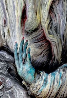
Add to these knowing, but appropriate references, Brown’s swirling painted ‘brush marks’ and the livid colour scheme, and the result is an image of death and decay. The painting coldly asserts, through the motif of the distorted pontiff, that there isn’t a Spiritual Essence in the Universe. All we have is the despair at the pointlessness of one’s own existence, and if one uses the analogy of looking too long or too closely, for thinking too hard or too rationally, sensations of disgust and nausea. It is hard to summarise it better than Bataille’s 1958 review of Satre’s literary work “the entire novelistic work of Sartre seems haunted by an obsession with a rotten decomposed mouldy world one full of sickening secretions” [1]. The same could be said for Brown’s obsessions in his paintings.
[1] Menninghaus, Winfried Disgust: the theory and history of a strong sensation SUNY Press 2003 p356
©blackdog 2009