Matthias Weischer

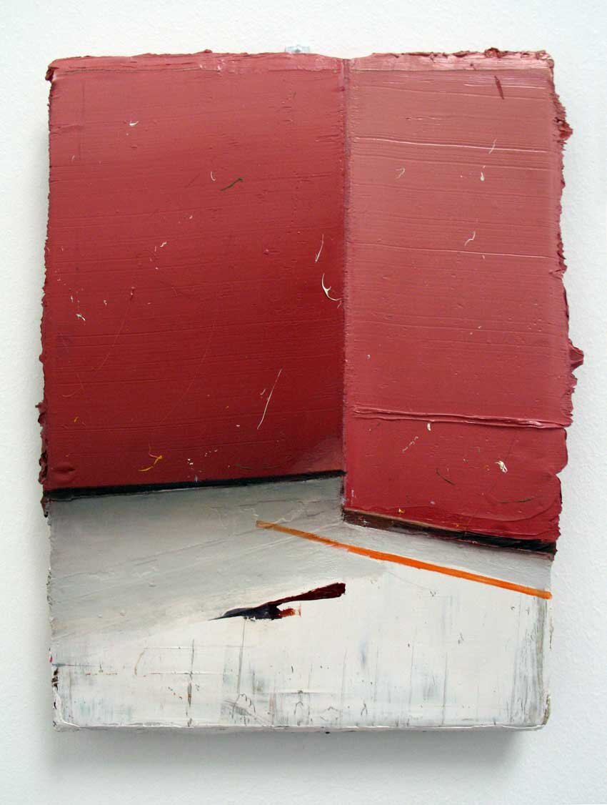
Ecke, 2005
Oil on Canvas, 40 x 30 cm
51st Biennale, Venice
1st November 2005

Despite his work being in the Saatchi collection and at Frieze 2004, I had never seen it in either print or at an exhibition before. This is a man who is obsessed with interior space. Almost every painting shown was an interior, all sparsely furnished and unoccupied. In fact I cannot even remember a door or window and the overall effect was of very claustrophobic spaces. I felt they were almost a mental space rather than an actual space - probably because there were limited details to associate with.

weischercorner2005st.jpg

My favourite was this simple painting of just a corner. It is typical of the work shown, exploring space through the construction and deconstruction of an imagined interior by building up layers of paint at the same time as creating overlapping perspectives. The paint is so thick that it overhangs the edge of the canvas (see below) making the image almost a sculpture. Then having created the space and depth within the picture, with the thickly painted surface he reminds us of the flatness of the painting by covering areas with fine speckles or drips of paint.

In all of his interior views there is an all-prevailing absence of a utopia, they are sites that seem to have no relation with the real space of Society. However, nor are they sites of voyeurism like the sets of television reality programmes such as Big Brother. These are fundamentally unreal spaces, offering nothing to distract the occupants from their own existence or let them forget their own life. We are given no clues as to the function of the rooms and without windows and doors it is as if the outside world doesn’t exist.

95 weischercorner2005side.jpg

The other interesting aspect of these spaces is the difficulty one has assigning a date or a period to them. Devoid of meaningful visual clues, even when a sparse piece of furniture or decoration is included, we are thrown back on regarding the walls as intersecting colour planes. For me this reinforces the notion that these rooms are psychological rather than physical spaces. Without a connection with time or reality they become somewhere to mentally retreat to, and be alone for reflection and contemplation.

©blackdog 2020
Vilhelm Hammershøi

Vilhelm Hammershøi

Resting, 1905
Oil on Canvas 49 x 46 cm
Royal Academy, London
3rd July 2008


A woman is seated on an open backed chair, with her hair gathered up in a bun. Her right arm is hooked over the back of the chair. Her gaze is at the wall on the left hand side of the painting. She is wearing a black skirt and a dark grey blouse with puffed sleeves and a scooped neck. A piece of porcelain is on a table/dresser on the right and side. Light is coming from the left hand side of the painting and catches the back of her neck and the porcelain bowl. A shadow is cast on the floor and wall on the left hand side.

Canvas is quite fine and has a thin umber colour over the primer. The painting has been built up with a series of thin washes, particularly noticeable in the blouse. Uses a round brush very confidently to apply thicker paint to depict the folds in the blouse; reminds me of Manet. Particularly liked how he uses the paint to delineate the arm, but the body of the blouse is just the ground colour.

Hammershøi Resting.jpg

Uses thicker paint on the neck which is applied with short brushstrokes of a short flat bristle. The back of the chair has a similar treatment with the brush work following the form, although he does leave some small areas without paint. Brushwork for the wall is almost cross hatching except where it meets the figure, then it follows the form. The light to dark transition of the shadow on the wall looks to be in slightly thicker paint – although this appearance might be as a result of wet in wet blending.

The painting is behind glass, so it is hard to tell how rich the oil in the paint is, but looking at unglazed examples from the same year, I would say the paint is lean and has been varnished afterward.

The composition is a series of right angles, which clearly owes something to Whistler’s Arrangement in Grey and Black: The Artist's Mother from 1871. Like Whistler, he conveys a sense of harmony with his composition, but I think Hammershøi’s painting is much more melancholic. It is the anomalies within the painting that I perceive as melancholic.

The fact that the sitter is deep in self-examination displaying total indifference to the spectator is the main incongruence in what is a classic portrait composition, but there are other more subtle nuances. The crop of the flower-shaped bowl laid on the sideboard, the loose brush work in such a tight ordered composition, and the arm hooked over the back of the chair.

In this as with all his other paintings shown, nothing is seen to be happening, and as Felix Krämer notes in the exhibition catalogue ‘the figures introduce no element of vitality into the rooms’[1] resulting in a pervasive mood of ennui and time suspended.


[1] Felix Krämer Vilhehm Hammershøi: The Poetry of Silence Hammershøi Catalogue, Royal Academy of Arts 2008, page 25


©blackdog 2020

Michael Borrëmans

Michael Borrëmans

One 2003
Oil on Canvas 70 x 60 cm
Parasol Unit, London
4th June 2005


The last time I visited this space it was housing the Carnegie Art Award in 2004. Since then it has been transformed from a crumbling warehouse into a really beautiful exhibition space. I was one of the first visitors after the opening and the polished concrete floor is amazing. I would love one in my own studio! This was the first work I had seen by Michael Borrëmans, and it was totally suited to these airy pristine galleries. The work was sparsely hung and I had plenty of opportunity to contemplate the paintings.

It was very hard to grasp the meaning of his paintings, but the pervading mood throughout the work for me was one of melancholia. With so many melancholic works in the exhibition, I find it hard to choose a specific painting. I have picked a very interesting profile of a self absorbed woman whose melancholic mood has something in common with Dürer’s Melencholia I. She is in a doll-like state between dreaming and vigil.

09 Borrems.jpg

The ground is various random sketchy marks made with different brushes and blue grey paint. This has then been knocked back with a thin pale glaze. The figure is painted over the top, realistically for the face and hands, but very sketchy for the shirt - in fact little more than outline with a few pearly white highlights. His painting shows painterly flourishes of Baroque pictorial economy similar to Velásquez. Light comes from behind the figure and is painted very delicately - no deep shadows.

The fascinating bit is the oily rich brown glaze over the lower part of the figure, yet around the arms and hands. It looks like she is seated at a table that goes right through her, turning what could be read as a straightforward portrait into something much more enigmatic. This surreal notion of the figure evolving from the table links his work with the paintings of Magritte and other examples of his work demonstrate temporal disconnect more clearly.

As to the meaning of the painting, I find it pretty impenetrable - the title doesn't offer a clue (this was same for all the paintings). Is she working on the table surface or contemplating her hands? She is gazing down at her hands very intently so perhaps she is preparing to type, yet there is no typewriter? Hand gestures are also a repeated motif in other works in the exhibition, and it each case the action looks frozen.

The hair cut looks like a style from the 1940's and the face seems to have the austerity I associate with the period. It is probably painted from an old photograph or made to look that way. This reference to a time past enhances melancholic feel of the image and instills a certain feeling of nostalgia. In an interview for with Luk Lambrecht for Flash Art he acknowledges working with existing images, ‘Sometimes these images are indeed photographs from a distant past. I attempt to create an atmosphere outside time, a space where time has been cancelled.’[1] In fact, I do get a sense of time being frozen – she is almost a still life, concentrating on what she is about to start, but never actually starting.


[1]Luk Lambrecht MICHAËL BORREMANS - I AM AN AVANT-GARDE ARTIST! Flash Art Online (Translated from Flemish by Dirk Verbiest)


©blackdog 2020

Leon Golub

Interrogation II, 1981
Acrylic on Linen 305 x 426 cm
Irish Museum of Modern Art ,19 September 2000

This was an immense exhibition of over 80 piaintings by this American artist and the first time I had seen his work first hand or in reproductions.

Totally unprepared, the shock of seeing so many of these larger than life scale paintings of oppression and cruelty was palpable. Golub's massive unframed canvasses depict scenes of mercenary killings, torture, and death squads. The show made me feel uncomfortable long after I had left and I could have chosen many individual works to write about, but this one stuck in my mind.

39 interrogation II.jpg

Like the other 38 large scale works it is on unframed but primed canvas that like sailcloth has had large eyelets attached to allow the work to be stretched. He works from an image bank of collected newspaper and magazine clippings and photographs of various body types, violent acts, and weapons. Then using these photographs as models, he draws directly onto the large canvas and then applies layer upon layer of paint, scraping back and reworking the surface in the process. The result is an expressionist surface where the figures, although unified by the process, lack any modelling making them as flat as the space they occupy.

The interrogators of the title are not specifically located, but through the device of flattening the image plane with the red oxide ground and cropping the legs, a continuity of space is suggested between them and you, the viewer. This breakdown of the gap, the enlargement of the protagonists and the direct eye contact they make suggests not only their power, but also makes you feel involved and complicit.

This ability to take the viewer into areas restricted from the public gaze took a dramatic shift with the images of torture that came out of Abu Ghraib in 2004, making Golub’s images of Mercenaries posing for the viewer/camera seem prescient. However, this need to expose the suppression of similar kinds of torture by the state is not new in art and Goya’s Disasters of War series of etchings from 1808-20 are clearly an influence on Golub’s work as might be Max Beckmann’s 1919 painting The Night.

Unlike those works and despite a process that implies loss (the painting and scraping back of the image, eroding and reconstructing the image) I don’t find the image melancholic. Is this something to do with the denial of the victim’s identity? Perhaps the victim as a sacrifice allows him to become a scapegoat and we fail to identify with his suffering.

These are not images to be seen in a book, as the predominant aura comes from the power of the mercenaries and their invasion of the viewer’s space and the work requires the audience's participation to make it complete. Consequently, whilst we may deplore the torture, part of us is relieved that it’s not us under the hood, and the knowing looks of the men drive home our complicity in the almost pornographic action. Maybe that’s the inherent sadness of the image, not man’s inhumanity to man, but the fact that like hard core pornography it is supposedly done for our benefit?

©blackdog 2020

Norbert Schwontkowski

Das grüne Leuchten, 2005
Oil on Canvas 55 x 70cm
Not Seen

Unfortunately I have only seen this painting in photographic reproduction, which isn’t ideal for such a subtly painted work. However, I have seen a number of similar pieces from the same time at art fairs, which gives me an understanding of his process and how the finished paintings look.

Schwontkowski green ray.jpeg

He adds metallic oxides to his ground which lead to unforeseeable changes of colour in his paintings as the chemical compositions change through oxidation. He will start a canvas, leave it to mature for a couple of weeks and then return to it and modify the altered state.

Like most of his work, the image comes from his imagination rather than an appropriated source. It shows a tiny incident all too familiar from my childhood holidays - our car was always breaking down too! Innocent in itself but the gaseous lime green glow hovering on the horizon fills the image with a sense of dread. The family watch from a safe distance whilst the father, head under the bonnet tinkers with the engine. It is almost as if the family are hovering on the horizon between mundane reality and the surreal happenings beyond.

The painting has a gentle naive quality, but as with all his work the title and image are inextricably linked, and translating this title as The Green Light we see he has a sense of irony too; green for stop rather than go! I associate the green light in this painting with the dreary tones of winter skies that warn of an immanent snowfall, but it could also be read as a green ray. These are rare optical phenomena that occur shortly after sunset or before sunrise, when a green spot is visible for a short period of time above the sun, or a green ray shoots up from the sunset point. It is usually observed from a low altitude where there is an unobstructed view of the horizon, such as on the ocean.

Although it is the image itself that fills me with a sense of loss, the process is a key component of the melancholic feel of his paintings. It is like a slow version of the development process associated with wet photography and results in the luminous glow of pastel colour that haunts his work.


©blackdog 2019

Marlene Dumas

Gelijkenis 1 & 2, 2002
Oil on Canvas, Each 60 x 230 cm
Punta della Dogana, Venice 2009

This diptych by Dumas is based on the famous Hans Holbein the Younger painting The Body of the Dead Christ in the Tomb”, both of which are now owned by François Pinault and were on display in his new contemporary art space in Venice. They were originally exhibited one above the other, but for some reason his curator has split them onto separate walls. I felt this diminished the concept and made any concept behind the work hard to grasp. Of the two it is the second canvas that is the closest to the Holbein which is in the Basel Kunstmuseu(not seen), and whilst it is only a facsimile or simulacrum, the copy draws a power and melancholic aura from the original.

2002-Gelijkenis-1-Dumas.jpg
2002-Gelijkenis-2-dumas.jpg

The painting represents a corpse stretched out on a slab with the loins covered with a white cloth. The painting is life sized and we view the painted emaciated corpse from the side with the right arm in full view with the hand protruding slightly from the slab. The chest shows a blackened wound from the soldier’s spear and the hand the stigmata from the crucifixion. The expression frozen on the face is one of hopeless grief, a man deserted by God without any promise of redemption.

Unusually for a painting for a painting from the 16thC, Holbein leaves the figure alone without the usual coterie of figures immersed in grief but also in the certainty of the resurrection. It is this isolation that endows the painting with its major melancholic burden more so than the limited palette of greys, browns and greens. Perhaps Holbein, himself a humanist on the threshold of atheism, is expressing his religious doubt. There is nothing more dismal than a dead God, and by painting a faithful representation of the dead body of a man taken from a cross with the head thrown back in suffering (rather than with the customary traces of beauty combined with the agony on the cross), Holbein confronts us with that possibility.

So what is Dumas trying to achieve with her copies? As she says “you can’t ‘take’ a painting, you make a painting, [1] and consequently for her it must be a decisive moral act. Perhaps the clue is that the first canvas is also partially based on a tabloid image of Michael Jackson sleeping in his oxygen chamber (in an effort to stave off his own mortality). Clearly the paintings have to be read as a pair and perhaps she is emphasising that we are a culture without the will to seriously examine our own problems. We prefer to be provoked and titillated rather examine our real problems, eschewing issues that are complex contradictory or confusing.

©blackdog 2009

[1] Dumas, Marlene “The Private Versus the Public” Marlene Dumas: Miss Interpreted Van Abbesmuseum 1992. 43

Elizabeth Peyton

Jarvis, 1996
Oil on Panel 27.9 x 35.6 cm
Whitechapel Gallery 2009

This painting is typical of her work during her ‘rise to fame’. She dropped the small intimate works on paper of historical figures in 1995 and focused on painting. These portraits predate the images of her friends and take the form of tributes by an adoring fan. Despite the distancing effect of working from photographs, the intimate scale, delicate brushwork and directness of touch communicate a romantic love for her subjects and the accompanying anxiety.

Elizabeth Peyton jarvis.jpg

This portrait of the singer Jarvis Cocker is a rare composition in her work in that the subject is engaging in eye contact. Typically the skin is bleached to near white and the features are idealised with ‘Rossetti’ lips.

Her colours are clear and transparent and applied in thin loose strokes on primed board. The red-violet of the jacket is set off wonderfully by the touch of lemon yellow in the background. The New York Times critic Roberta Smith accurately describes her style as a strange blend of ‘part Abstract Expressionism, part Renaissance miniature, with a touch of Pre-Raphaelite romanticism thrown in for good measure’.

The panels for her paintings are masonite, which is only available in America (invented in 1929). It is made from wood chips steam blasted and pressed into boards without the use of glues and binders. The nearest we have is medium density fibre (mdf) board which uses formaldehyde resin as a binder. The panels are about 2cm deep and are covered with very thick layers of acrylic primer. This has been applied with a scraper of some kind (I used to use a credit card) and the thick paint runs over the edges and the ridges in the surface become an integral element of the artwork.

In conversation with Steve Lafreniere, Peyton has an interesting response to his comment that there is a great deal of melancholy in her work…

“It’s not so much sentimental. It’s just that time passes. I am constantly thinking about it, and kind of obsessing about it. How things change, how I change, how there’s no stopping it. But when I’m painting, I’m very unaware. I’m not thinking about any of these things. It’s this other place. I know that sounds like mumbo-jumbo” (2)

Yes it does, but I think that despite her denial it sounds like a sentimentality for the past and that her paintings both acknowledge, but also try and arrest the march of time. The fact that she separates herself from these feelings when she paints implies that her painterly expression is stylistic or synthetic rather than emotional. In other words she uses the tropes of expressionism to evoke a reaction from the viewer rather than it being felt, say in the working of Van Gogh or Munch.

(1)Smith, Roberta Blood and Punk Royalty to Grunge Royalty NY Times 24 March 1995

(2)Lafreniere, Steve A Conversation with the Artist, Elizabeth Peyton Rizzoli International Publications 2005 p252


©blackdog 2009

Luc Tuymans

Luc Tuymans
Bend Over, 2001
Oil on canvas, 60 x 60 cm
Tate Modern, London
8th July 2004

This remains one of my favourite Tuyman’s paintings despite having seen it a number of times. These notes are from when I saw it in the Tate retrospective. It shared a room with other modestly sized paintings some as early as 1988. Despite this non-linear hang and the different themes, the uniformity of Tuyman’s painting practice makes the room work.

Tuymans’s career began with filmmaking, and consequently his approach to painting often draws from montage so additional meaning is conveyed by the pieces’ adjacency. In this retrospective he must have used this room to set up a new dialogue between the works as this piece was originally shown in a show at “The White Cube” called “The Rumour” amongst a series of paintings of pigeons.

luc-tuymans-bendover.jpeg

This painting, like the earlier works in the room uses short horizontal brush strokes to build the form and also blur it into the surrounding space. Also all the canvases are pinned around the edge onto thin stretchers, as and have no paint on the edges. I have read that he paints on the canvas prior to stretching, which would explain how he maintains this uniformity of look. The other common feature is the continued use of subdued pastel colours. The oils are thin and have a very flat dry look. The colours in this painting are perhaps best described as “sickly” greens and conjure up the institutional colour of old hospitals.

I suspect the source for the painting is a photograph but I cannot find a reference. The image looks like a man, possibly awaiting a thrashing but he or she could just be bending over doing exercises or picking something up. The background gives no indication of a location and the subject is tightly held by the close cropping of edges of the canvas. The former interpretation is perhaps reinforced by the command implicit in the title "Bend Over" rather than the posture i.e. “bent over”. Coming from a time when corporal punishment was still meted out in schools, I find it a powerful image that reminds me of the degradation we were subjected to. Maybe this painting helped Tuymans close an old wound, but it holds one open for me, and this memory isn’t made any more comfortable by Tuymans placing me (the viewer) in the position of perpetrator.

©blackdog 2009

Peder Balke

Peder Balke
Northern Lights, 1870s
Oil on Panel 20 x 10cm
National Gallery, London
19 January 2015

I was in the National Gallery waiting for my timed slot for the Late Rembrandt exhibition and thought I would kill time having a look at the free exhibition of the work of Norwegian painter, Peder Balke. An artist almost unknown outside of Scandinavia, that I had never heard of, using similar techniques to those I developed as part of my recent PhD thesis! One of those rare pleasant surprises that still happen from time to time.

Peder Balke was born on the Norwegian island of Helgoya and was one of the few artists to venture to the far North of his native land for inspiration. He explored the Arctic Circle and painted the frozen spectacle of the most remote regions of Norway for the rest of his life. His early style that offered him some limited success was represented in the exhibition, but the majority of works were from after 1850 when he had withdrawn from commercial painting to focus on a career in politics.

peder-balke-northern-lights-1870-trivium-art-history.jpg

I have selected one of the latest and smallest works in the show to review. Measuring only 10x20cm, this small irregular shaped painting on a wooden panel epitomises the effectiveness of his technique. Balke sets the scene by applying thin washes to depict the sea and sky divided by simple opaque marks to create a horizon of bleak mountains. Into the night sky he conjures the spectacle of the Northern Lights by vertically scraping away paint revealing the white ground below. The reflection of the lights on the surface of the water and pictorial depth is accomplished by using this technique horizontally. A final flourish is the addition of four boats of various sizes with a few marks and erasures giving perspective to the painting and accentuating the loneliness and isolation of the drama. This tiny painting becomes a metaphor for the despair of the artist’s soul, his career as an artist forgotten and even omitted from his obituary.


Whilst the division of the space into receding horizontal planes owes a debt to the compositions of Caspar David Friedrich; the use of simple motifs, freely painted on a surface unified by a minimal palette and his technique of removal of paint to effect light sets him apart from his generation of Romantic landscape painters. The fact that these landscapes were painted some 40 years after he had visited the far North made this idiosyncratic style both effective and appropriate to capture his memories of the sublime landscape. Contemporary painters such as Luc Tuymans (simplified motifs / palette) and Elizabeth Peyton (bold brushwork / the ground as light) have used similar approaches to signify loss and memory in their work. However, neither of them conveys the boundless isolation with their metaphors as consistently as Balke achieves in his late work. 

An online book of my own works based on The Caravan as a motif is available should you wish to see how I arrived at a similar technique to that used by Balke in his later paintings.  Just proves that no matter how original you think you are, there is nothing new under the (Midnight) Sun!

Peder Balke was at the National Gallery, London, WC2,
until April 12, 2015
(44-020-7747 2885; www.nationalgallery.org.uk)

Wilhelm Sasnal

Wilhelm Sasnal
Girl Smoking (Anka)
Oil on Canvas 45 x 50 cm
Saatchi Gallery, London
7 August 2005

I first saw paintings by Sasnal in the "Urgent Painting" exhibition in Paris in 2000 and this one was my favourite. It was a big influence both on how I wanted to paint and my choice of "Backs" as a subject. Since then I have not even been able to see a reproduction of the painting so this was a special day for me.

I must admit I was a little disappointed and felt it lacked the impact it had first had. This may have had something to do with the hang - in Paris it was part of a group of his paintings and was hung in a very dynamic way - here it was one of a group of three similar works conventionally hung in a small side room.

Able to get much closer here, and deduce how it was painted. Clearly drawn beforehand as the sketch is just visible in parts.

74 Wilhelm-Sasnal-Anka.jpg

Worked back to front, with the figure painted last. Medium thick paint and the brushwork can be seen. Edges are very sharp on the figure and the treatment of the hair is very good. I would say the face was dry before the hair was done. More fuzzy with blending of edges in the background, which gives a good sense of depth. Not frightened of using and showing shorter brushstrokes in difficult area eg between the chin and the shoulder.

Never thought of it at the time, nor made the connection since, but this painting is in effect a miniature Alex Katz. It is also pretty much a one off for Sasnal, most of his work being monochrome and derived from Luc Tuymans' style. Crucially, this brightness of the palette works against the inherent sadness of the image giving us a feeling of anticipation and hope, whereas his usual approach would have changed the mood completely.

2001-Dominika-33x33.jpeg

Another painting in the same group Girl Smoking (Dominika) 2001, Oil on Canvas 33 x 33cm, is much closer to his usual style of painting and the references to Black and White photography are clear. Also the colour scheme seems to reinforce the use of the burning cigarette as a metaphor for transience and slow decay.

© Mike Newton 2018