Euan Uglow

Lemon, 1973
Oil on Canvas, 19 x 33cm
Private Collection, Not Seen

In July 2003 I went to see the first public exhibition of the work of Euan Uglow since his death from cancer in 2000. Disappointingly this painting of half a lemon was not included in the show. It is quite unsual in that most of his work whether of nude models or still life involved a dynamic pose. The artist notoriously placed his models in geometrical and sometimes stiffly contorted poses and since he sometimes took up to five years to finish a painting and only ever painted from life, his models had to keep such poses for considerable lengths of time.

1973-Lemon-19x33.jpg

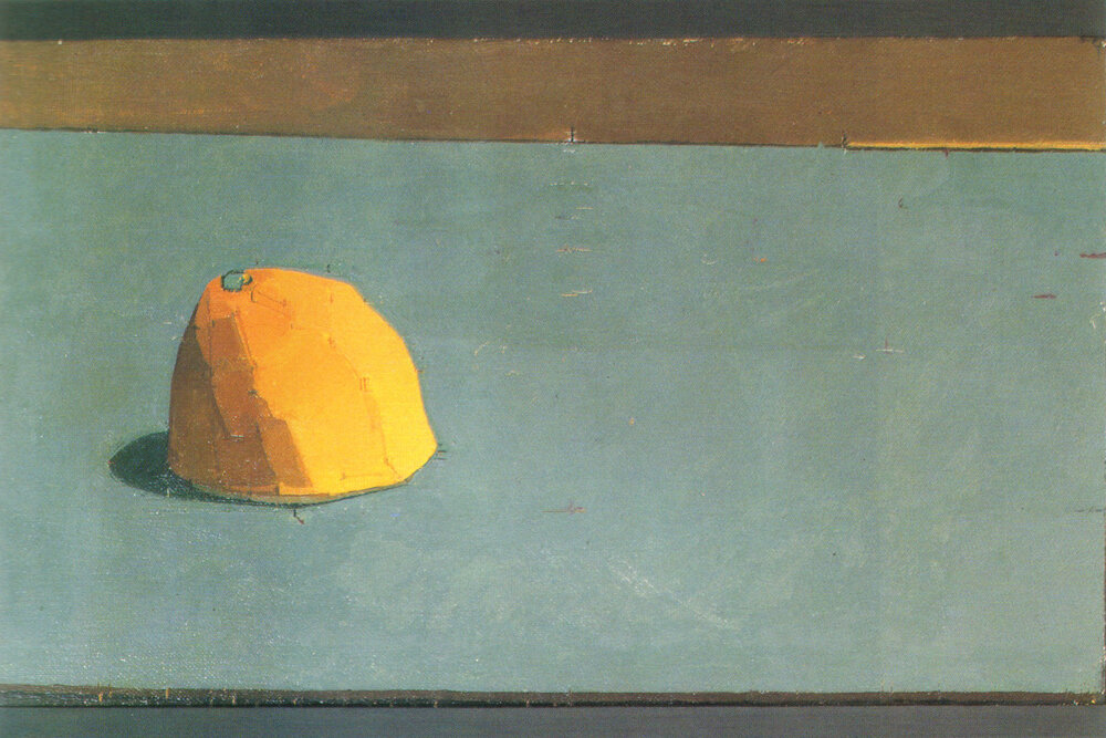
There is a sense of harmony within the image, not just about the placement of the lemon on the grey shelf, but also the weight of the graduated yellow in relation to the size of the background. The lemon is strongly lit from the right and his planes of colour give a suprising degree of three dimensionality to the flat surface.

I have seen a lot of Uglow’s paintings and drawings and this looks typical of his method working. Taught by William Coldstream at the Slade School of Art in London, he used little registration points and tiny painted crosses to help the drawing process. It is worth noting that his obsession with accuracy ran to marking these reference points on the skin of his life models and that they had to keep these marks between sessions. These marks always remain in the finished painting, revealing the history of its making by a prolonged process of looking hard.

He sometimes took up to five years to finish a painting and only ever painted from life and the marks become a record of the temporal aspect of painting. This recording the passage of time is taken a step further in a little painting I saw in his exhibition at the Holburne Museum of Art, Bath called Diary of a Pear, 1972. He placed the tip of a pear at the exact centre of a perfect square, but he painted so slowly that the pear rotted, and the tip drooped. So each day he began a new square with a new centre point and a series of marks showing where the tip had once been. He has said in interview that he “isn’t interested in producing pictures; but in personal research”

Perhaps because of this perfectionism his paintings seem to lack emotion and whilst I find them technically interesting I don’t feel that they have a melancholic aura, even when the subject is a lonely half a lemon.

©blackdog 2020

Giorgio Morandi

Still Life, 1962
Oil on Canvas, 30.5 x 30.6 cm
Tate Modern, London 2001

This was the first time I had seen his work and in all honesty I couldn’t remember any specific painting from the show, only the overall impression the body of work made. Consequently I have chosen a painting that was in the show, but that I have had chance to see at the National Gallery in Scotland subsequently.

The impression the Tate Exhibition left with me was one of incredible uniformity, each painting was a small still life and in one room the same objects in the paintings were repeated over and over. The palette throughout was predominantly muted colours and I have since learned deliberately referenced the colours of his home town, Bologna. Because he painted his bottles and boxes without any labels the arrangements were more about form than representation.

Still Life 1962.jpg

Although I went through the exhibition quite quickly and missed the immense complexity within the subtle variations of composition, I did spend enough time with a couple of paintings in the exhibition to appreciate their qualities of quietness and spatial harmony. I also remember preferring the later more abstract style of painting where the still life objects were arranged in a non-conventional way. So I was pleased to revisit this example of his later style in 2005, when I was more attuned to the quality of the nervous scumbled brushwork and the light that emanated from the surface. I was also aware of the significance of the tightly grouped objects that suggest to some the skyline of Bologna and to others family portraits.[1]

Looking at the work later I was also able to appreciate, in retrospect, that the painting was more about the idea than the things he saw, and that they were devoid of narrative. Yet he did paint from actual objects rather than from his imagination. The photograph of his studio shows a reconstruction of a typical set up for one of his paintings. Morandi once commented that 'For me nothing is abstract. In fact, I believe nothing more abstract, more surreal, than reality'.[2]

Casa Morandi.jpg

In this canvas I certainly felt there was more to it than the physical surface of the image, an aura which maybe because of my own circumstances at the time, I sensed as melancholic. It is something to do with the two black bottles cowering in front of the white vases, something edgy and uncertain. From a distance I find it hard to say whether I was feeling the artist’s intentions or if I was projecting my own sense of loss, but perhaps that doesn’t matter. I certainly didn’t see a skyline, but I did sense a family portrait where some of the members were lost.


[1] In fact I have since read that Darian Leader postulates in his book “The New Black: Mourning, Melancholia and Depression” that Morandi’s repetition and rearrangement of motifs might not just resemble family portraits, but also may indicate an arrested or stagnation of the mourning process

Leader, Darian The New Black 2008 Hamish Hamilton 30

[2] Quoted on Tate Modern webpage http://www.tate.org.uk/modern/exhibitions/morandi.htm

©blackdog 2010